Reimagining stories through visual identity, symbolism, and genre language.
This project is a collection of speculative (“spec”) book cover redesigns created as portfolio explorations. The goal was to reinterpret existing titles and imagined editions through a stronger visual narrative, modern typography systems, and concept-driven illustration.
Rather than recreating original covers, I approached each piece as if I were designing for a new release, anniversary edition, collector’s version, or alternate publishing direction.
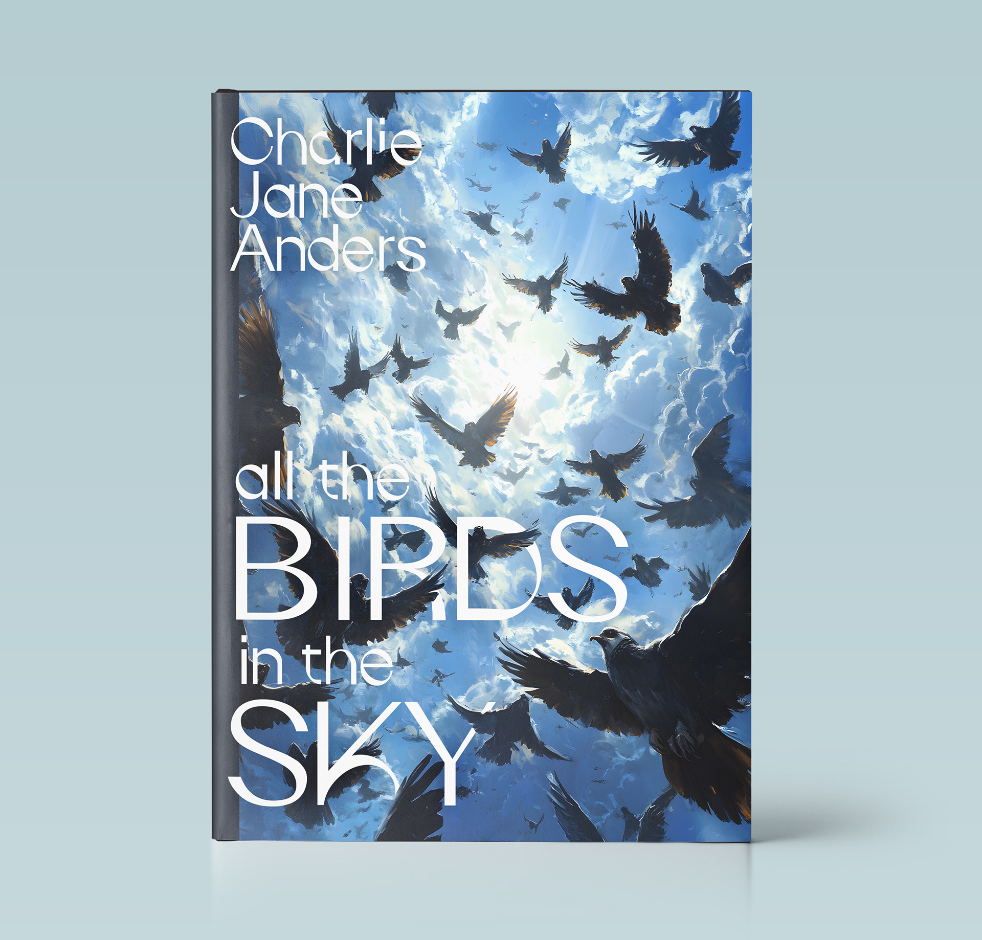
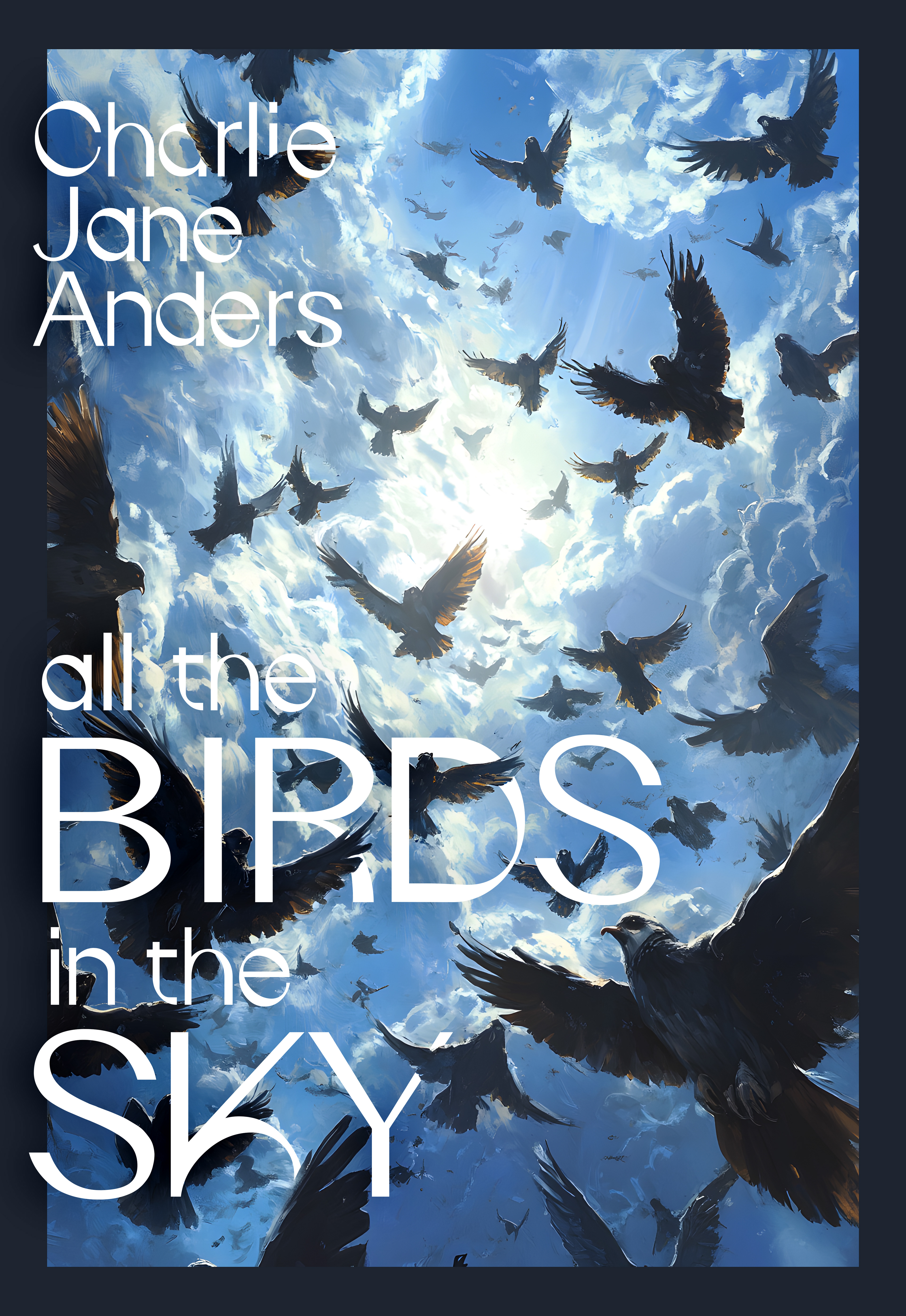
1. All the Birds in the Sky - Charlie Jane Anders
The concept centers on movement, chaos, and wonder. The upward perspective and flock formation create energy and immersion while the typography integrates directly into the visual flow of the piece. Cool blues and open sky space help balance density and create contrast.
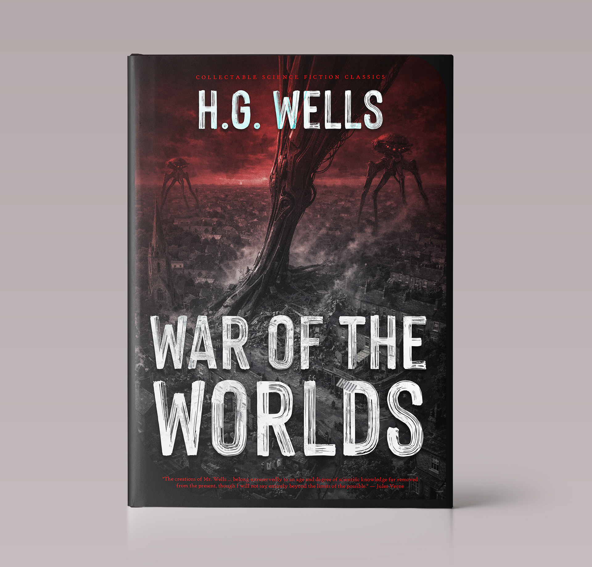
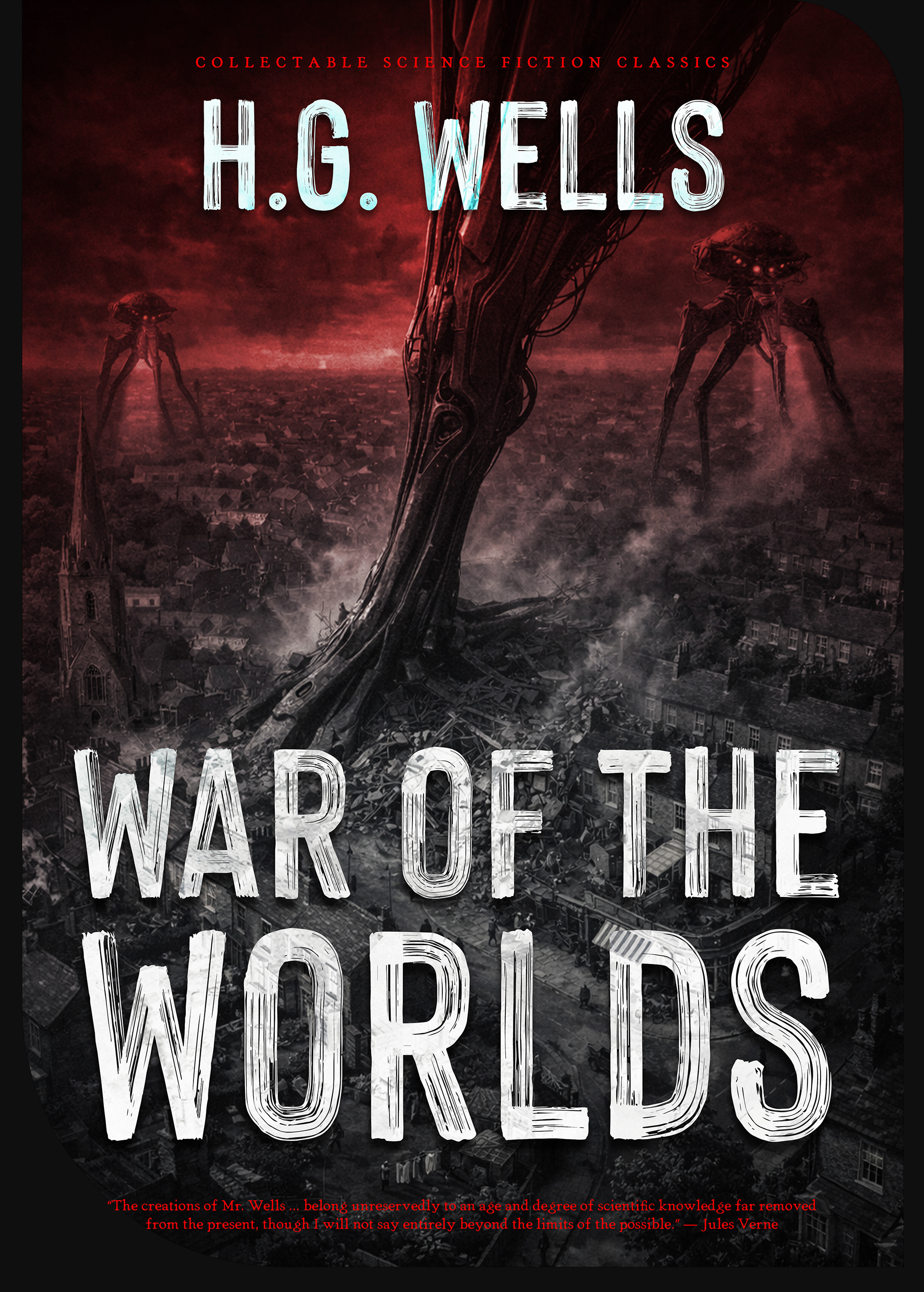
1. War of the Worlds - H. G. Wells
This redesign imagines the novel as a modern collector’s edition. Massive mechanical structures, destroyed landscapes, and a deep red palette push the scale of invasion while keeping the typography large and distressed for a classic science-fiction feel.
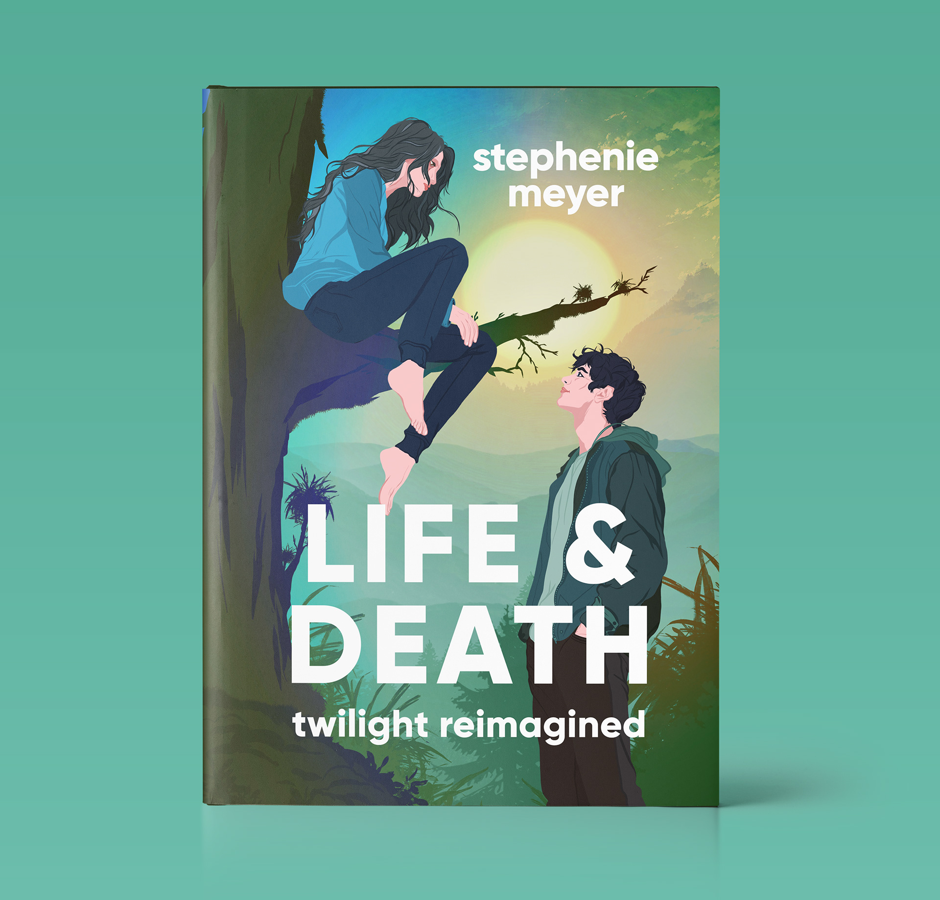
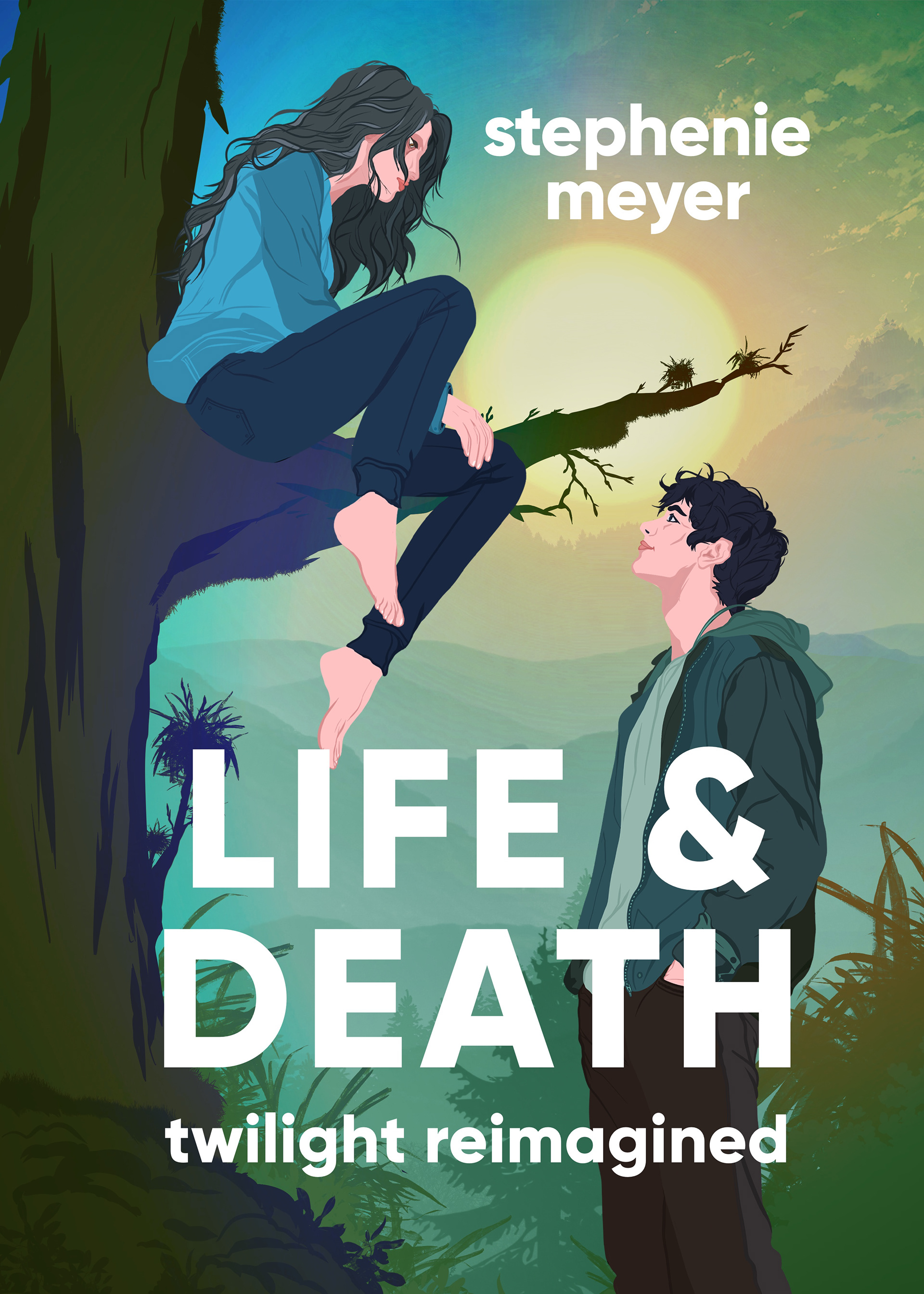
3. Life & Death (Twilight Reimagined) - Stephenie Meyer
This concept reinterprets the familiar world of Twilight through a softer, modern illustrated approach. Instead of focusing on dramatic fantasy elements, the design emphasizes intimacy, distance, and emotional tension between the characters while keeping the environment calm and cinematic.


4. Uzumaki - Junji Ito
Minimal but unsettling. The cover uses the spiral motif as the dominant visual element, allowing it to consume the composition and create discomfort through simplicity. High contrast red, black, and white keeps the design bold while preserving the psychological horror atmosphere.
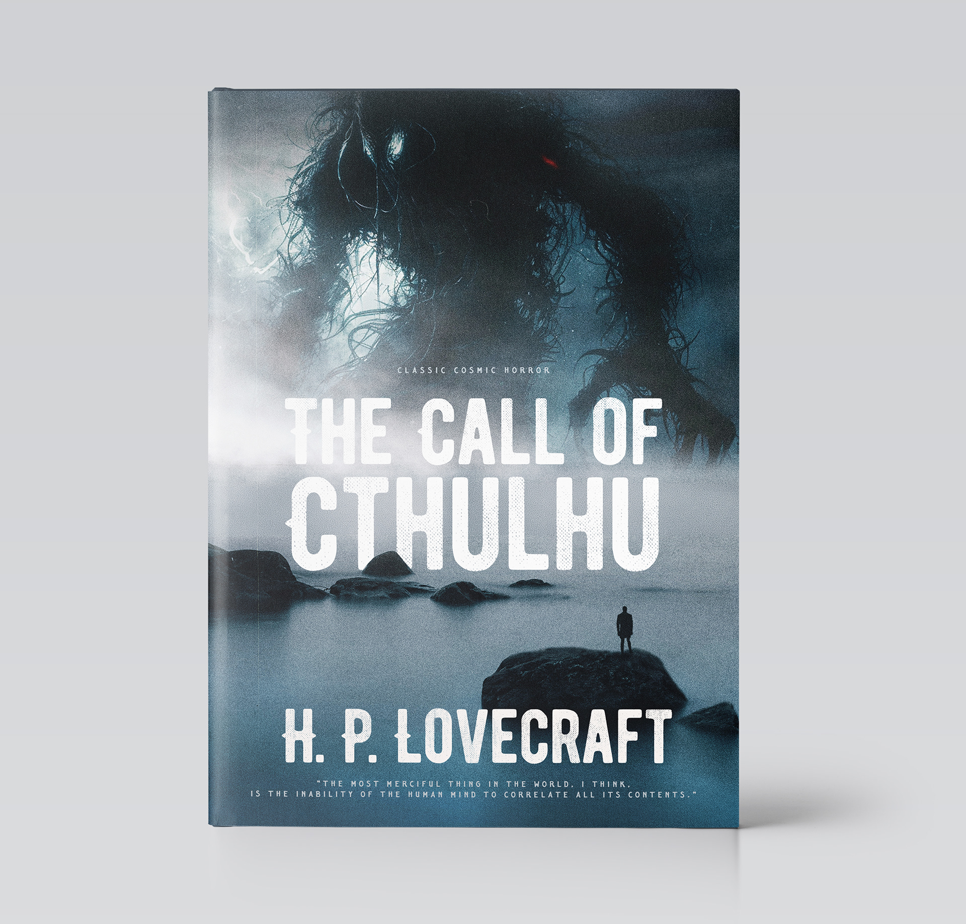
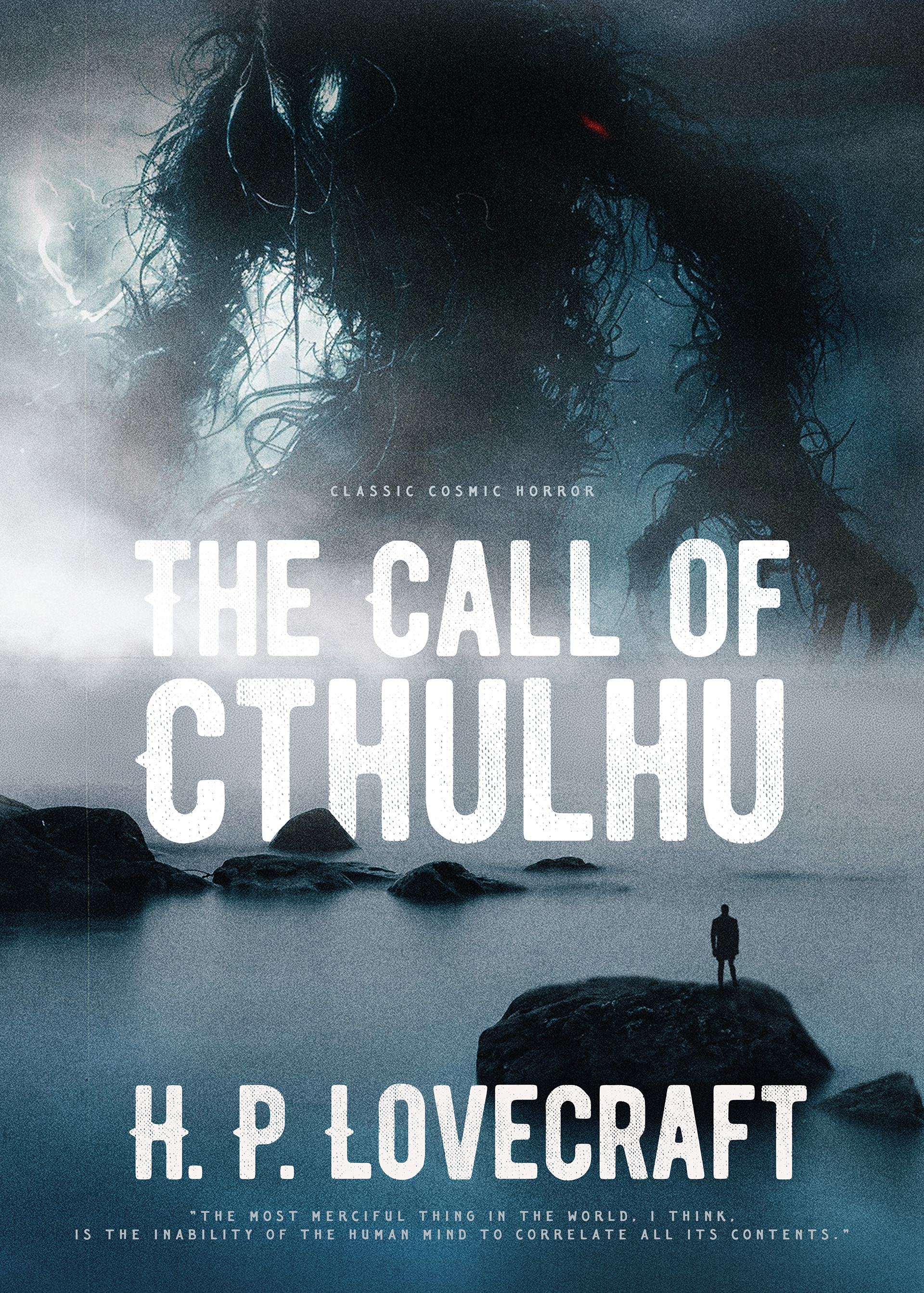
5. The Call of Cthulhu - H. P. Lovecraft
For this redesign, I leaned into scale and cosmic dread. The oversized creature silhouette dominates the environment while the isolated human figure reinforces insignificance, a central theme within Lovecraftian horror. Muted blues, fog textures, and negative space were used to create tension rather than relying on explicit horror imagery.
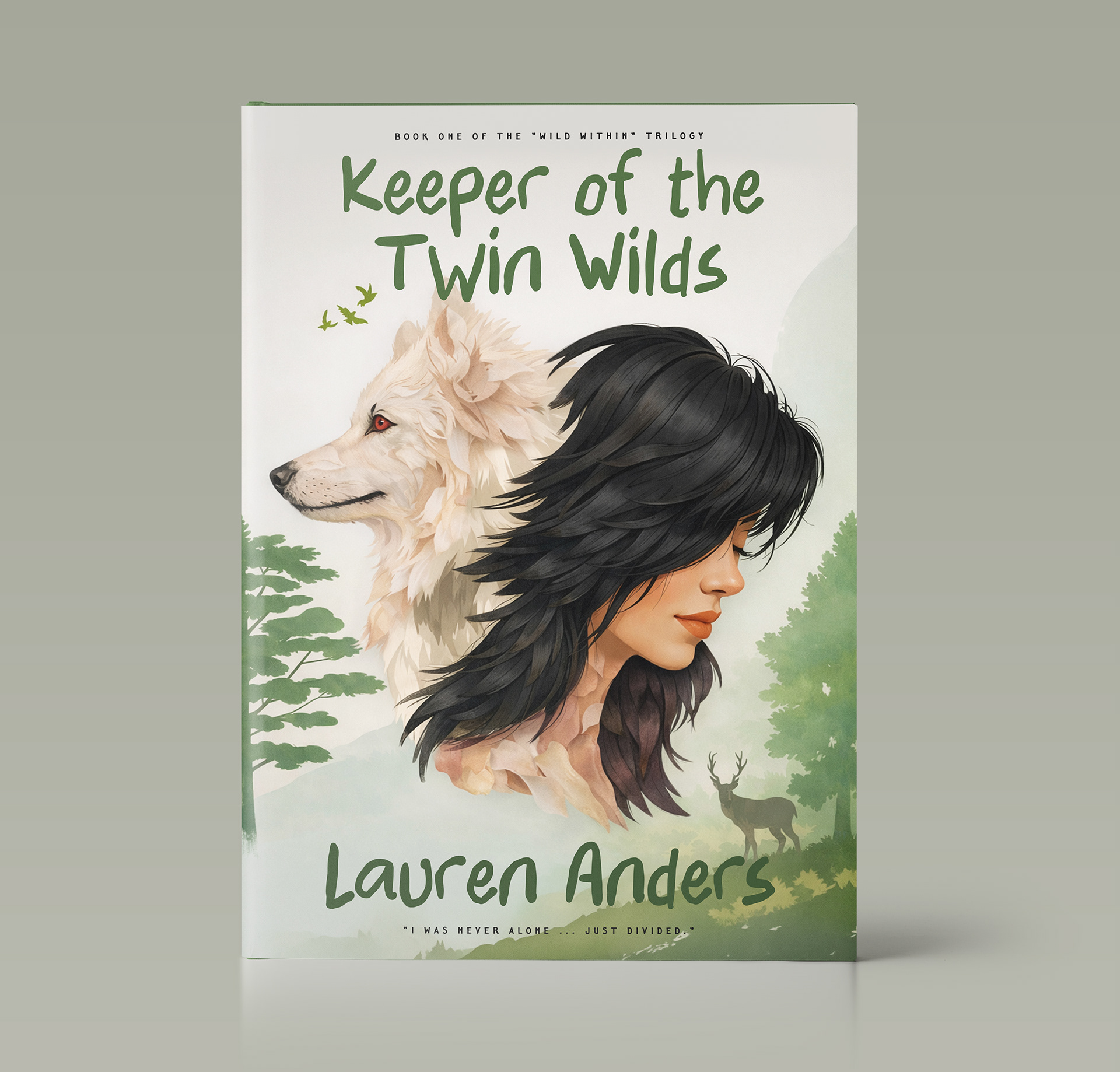
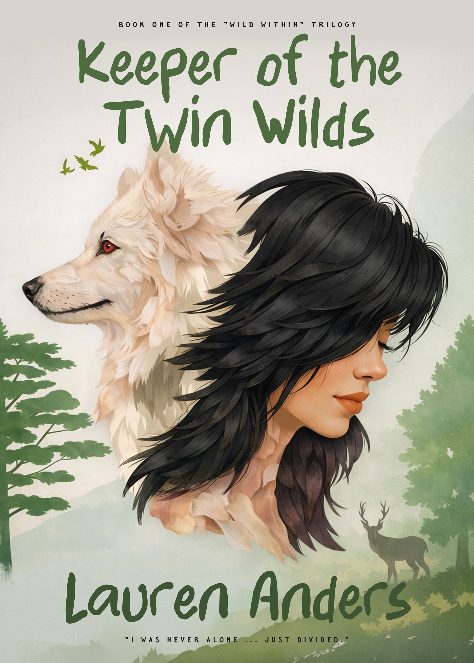
6. Keeper of the Twin Wilds - Lauren Anders
This concept explores duality between human and animal identity. The composition balances the protagonist with a white wolf counterpart, using organic shapes and muted greens to emphasize nature, connection, and wilderness themes.
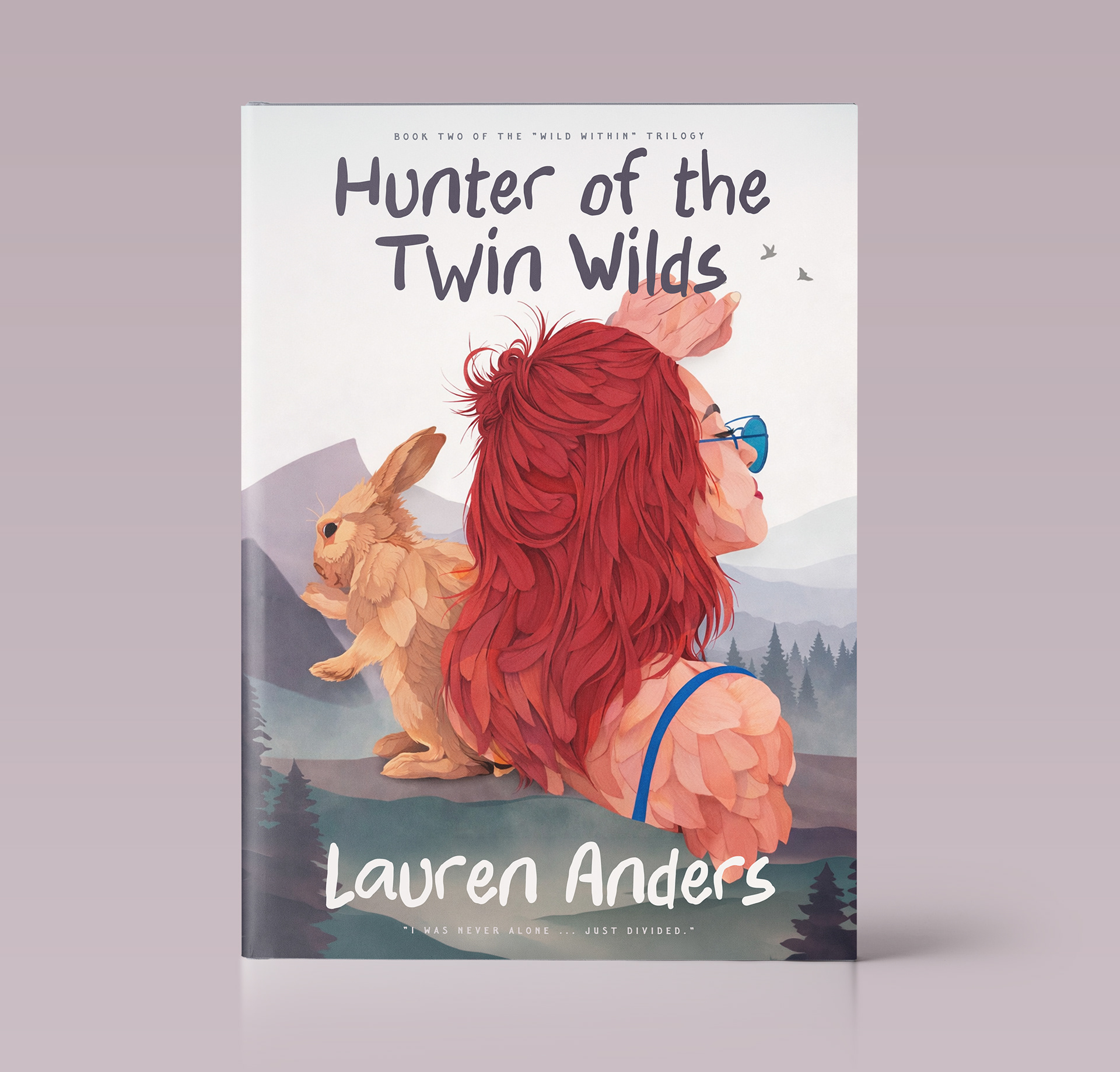
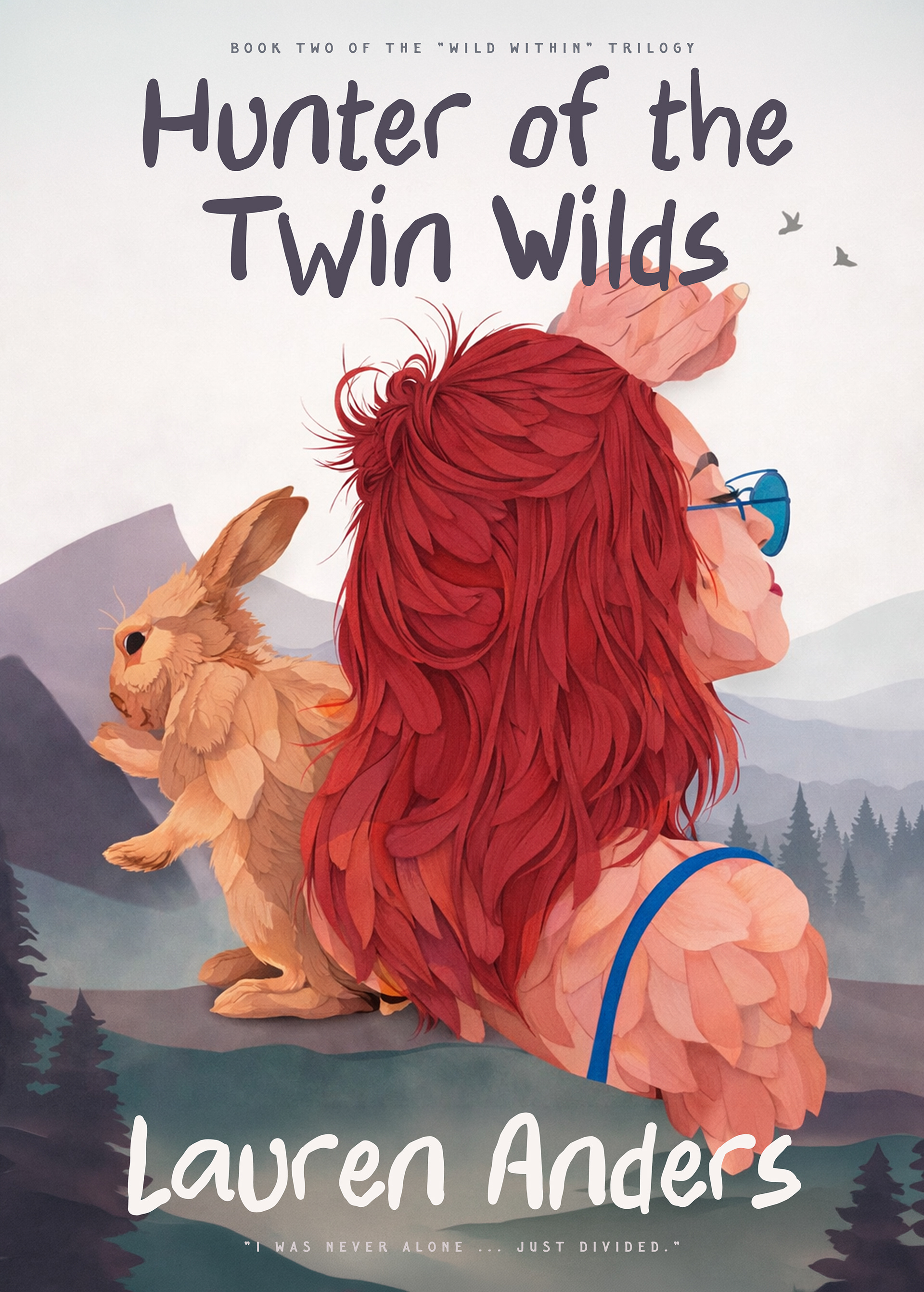
7. Hunter of the Twin Wilds - Lauren Anders
As a continuation of the series, this redesign shifts the emotional energy. Warmer tones, red accents, and opposing character placement create contrast while maintaining visual continuity with the first cover. The goal was to preserve series identity while allowing individual personality.
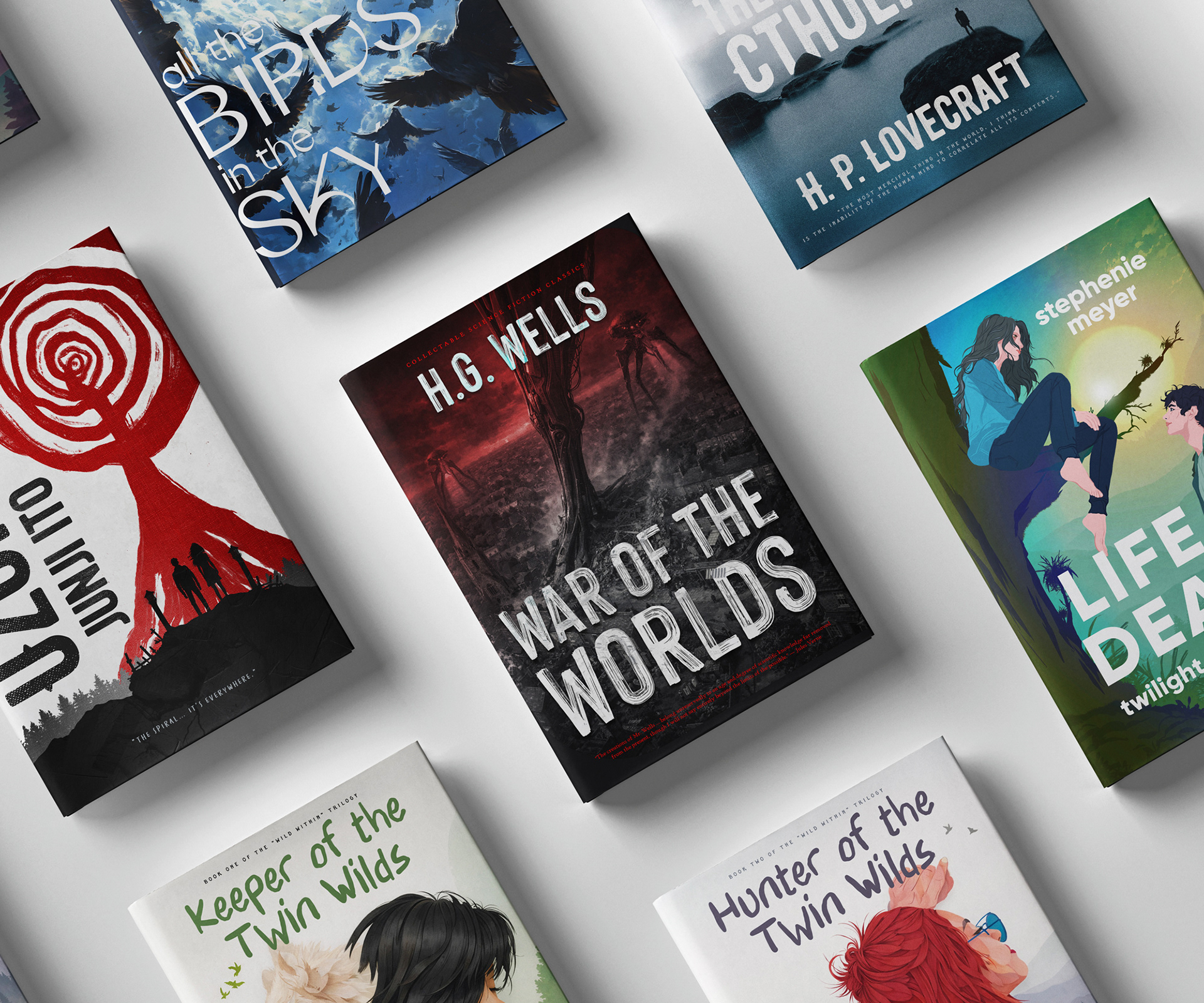
This series became an exploration of how cover design can shift the perception of a story.
Each redesign was approached not only as an illustration exercise but as a publishing problem: How would this book be positioned visually today? What emotions should readers feel before opening the first page?
These covers are imagined editions, alternate identities built through storytelling, typography, and atmosphere.